Branding


Development of a cohesive brand identity for a regional food hub in Bremen and Bremerhaven, designed as a platform for collaboration, trade, innovation, and research within the local food economy.
The brand needed to connect stakeholders across the entire value chain — from producers to distributors — and visually reflect sustainability, innovation, and future-oriented food systems.
Horizon line forms the core of the idea

Creation of a logo system based on the hub’s initials, translating strategic values into a distinctive visual mark.
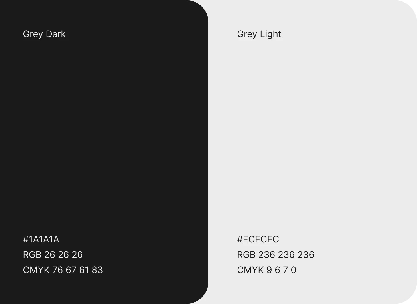
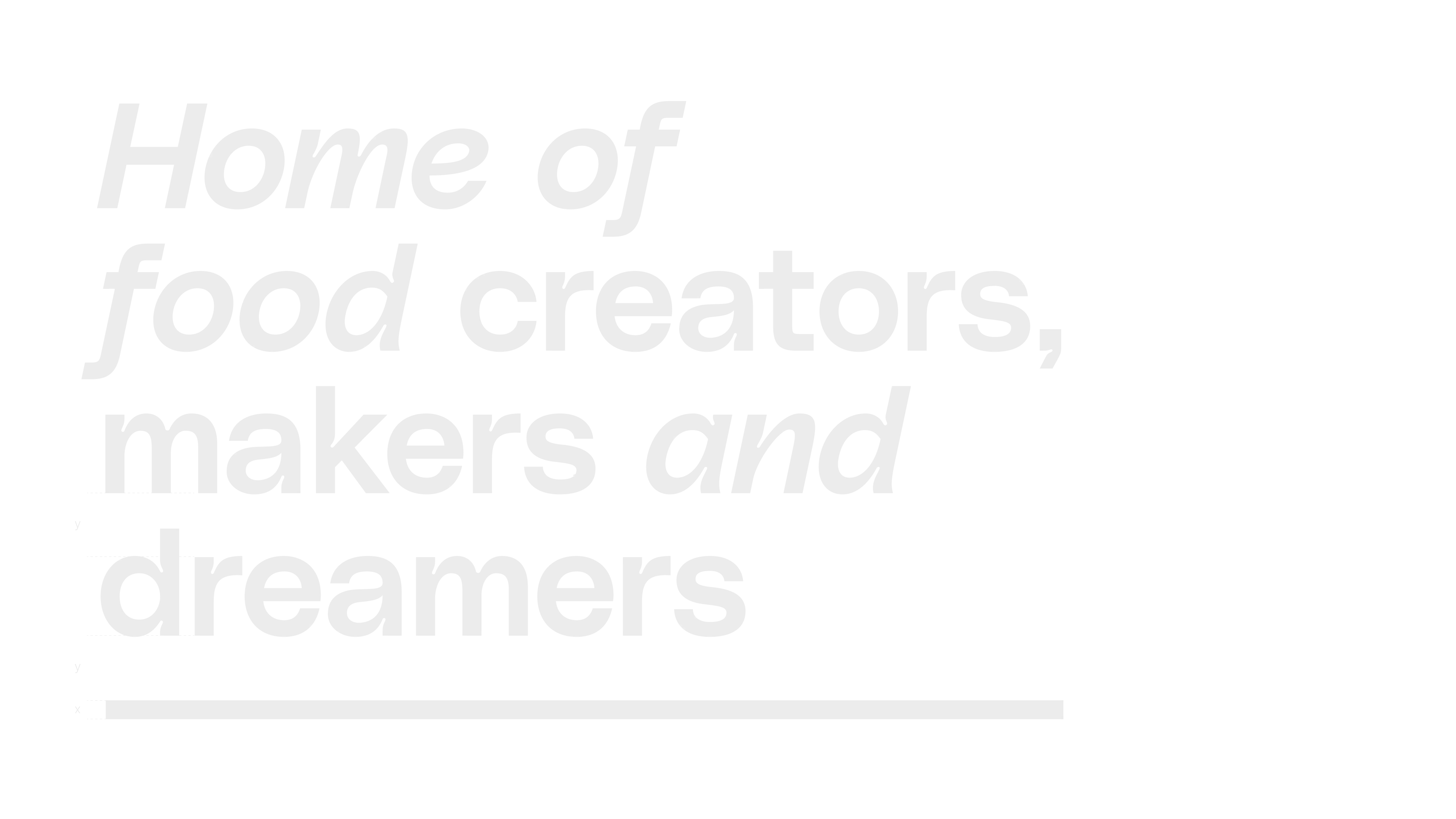
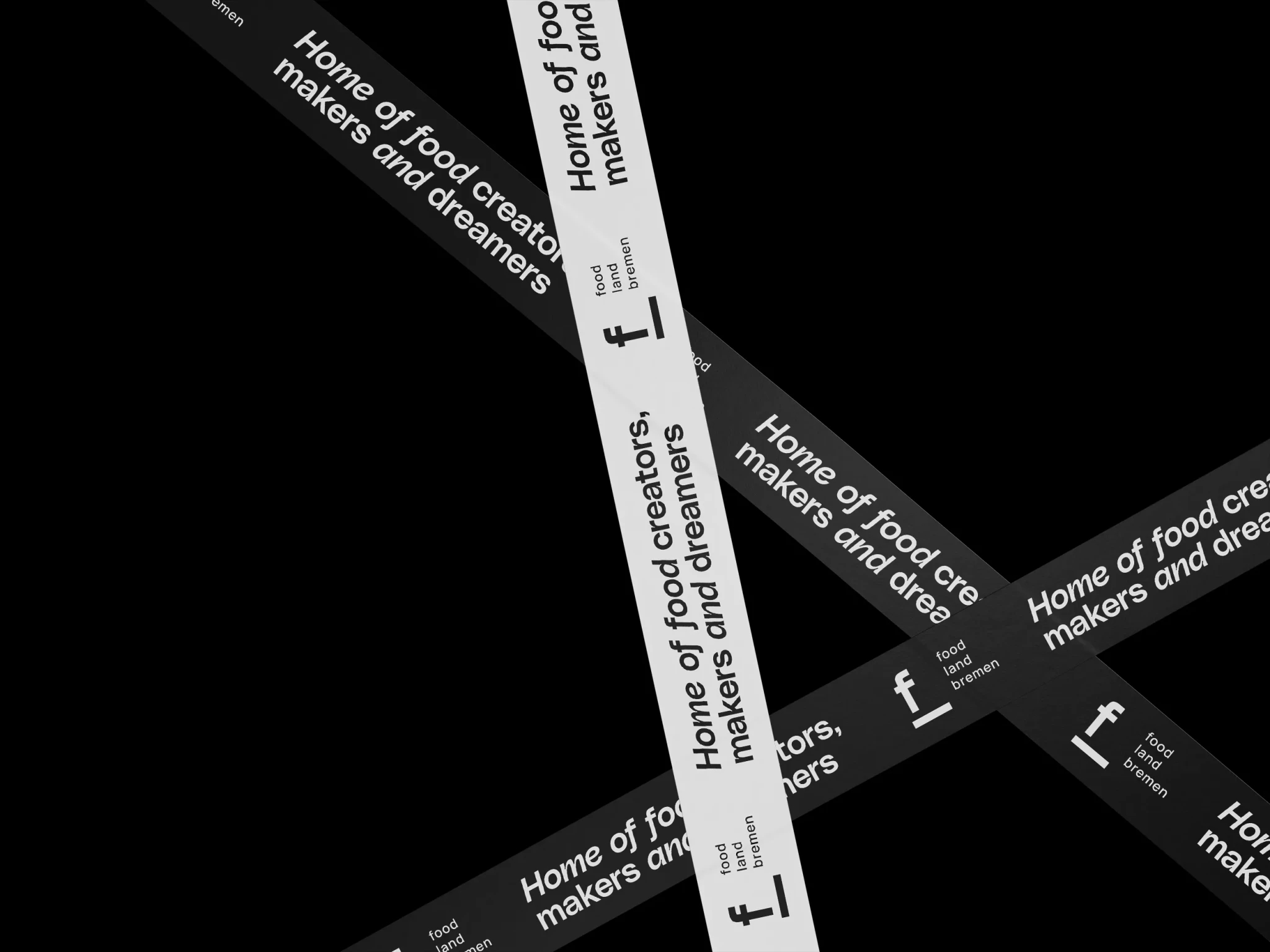
One letter is rotated 90 degrees to support the other, forming a stable base and symbolizing orientation. The overall shape suggests a view beyond the horizon, representing foresight and a forward-looking approach. The horizon line, combined with a clear and modern typeface, forms the core of the brand identity. The design is complemented by neutral light-dark contrasts and the use of subtly muted natural tones and understated imagery.
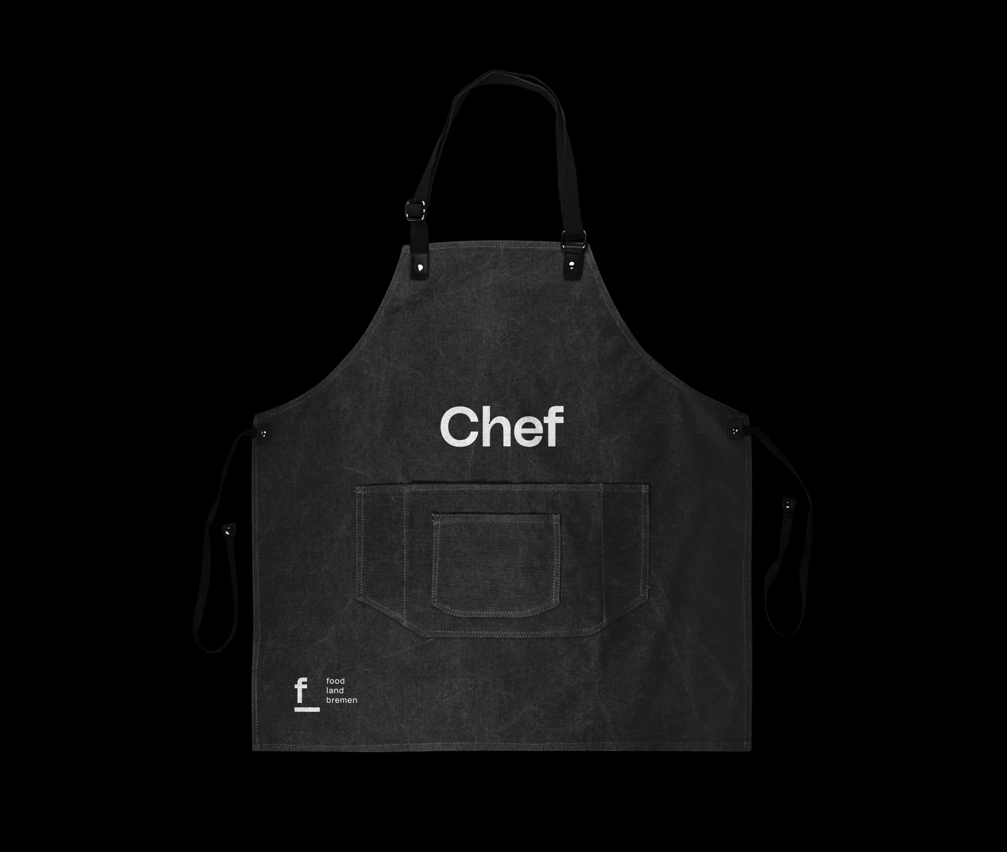
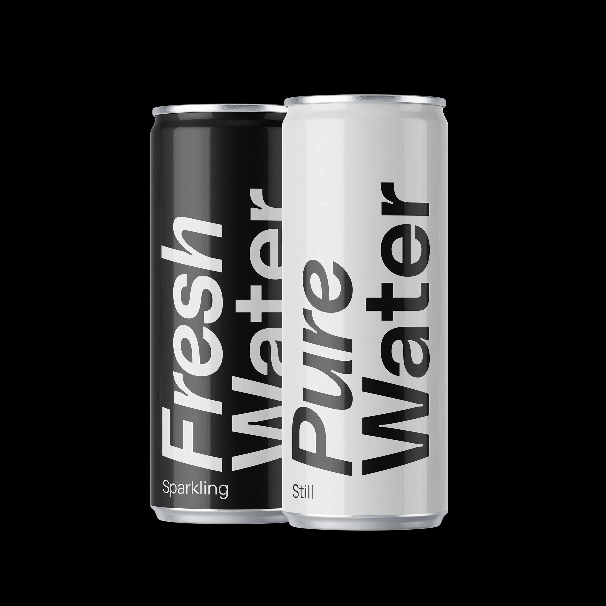
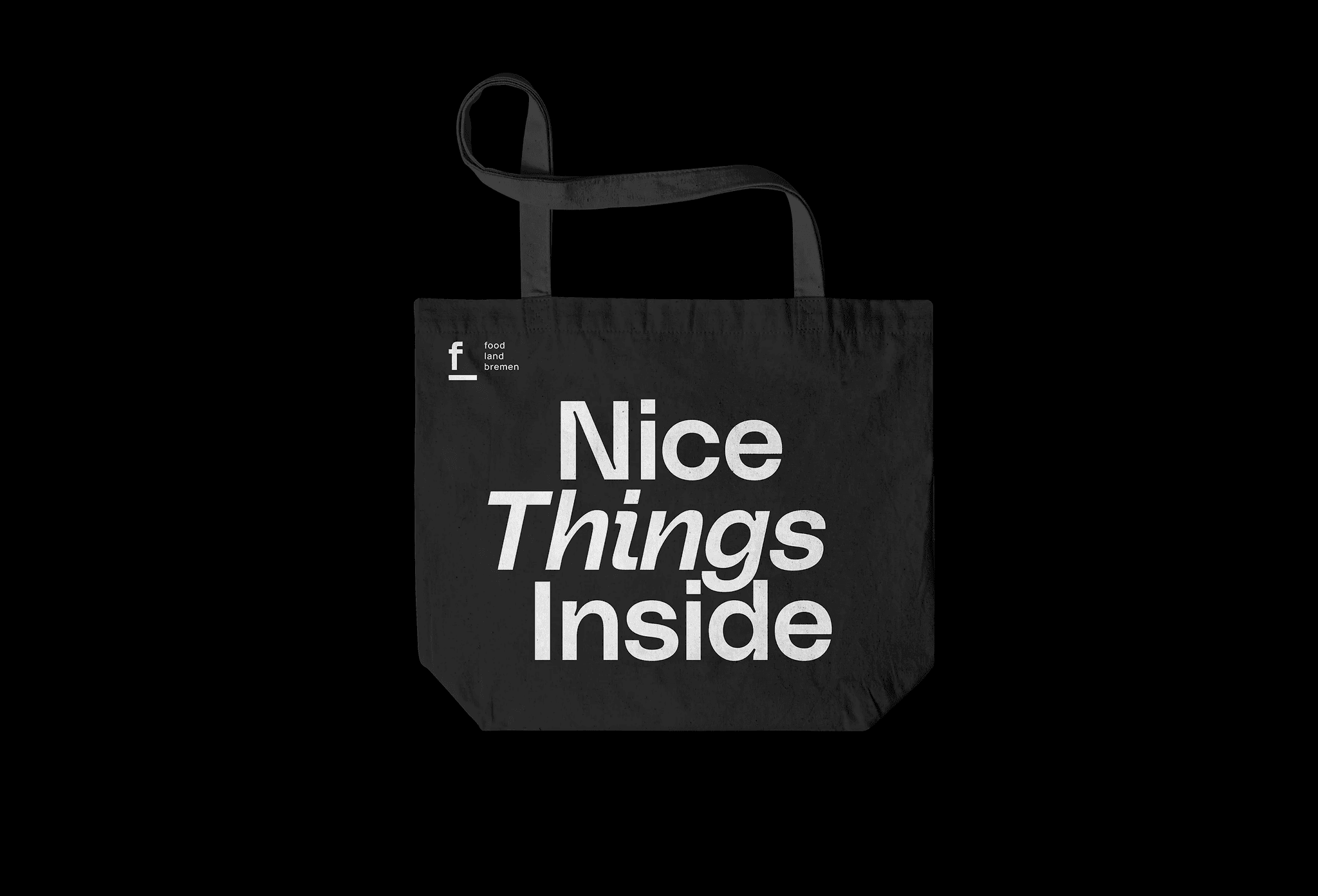
Brand Products


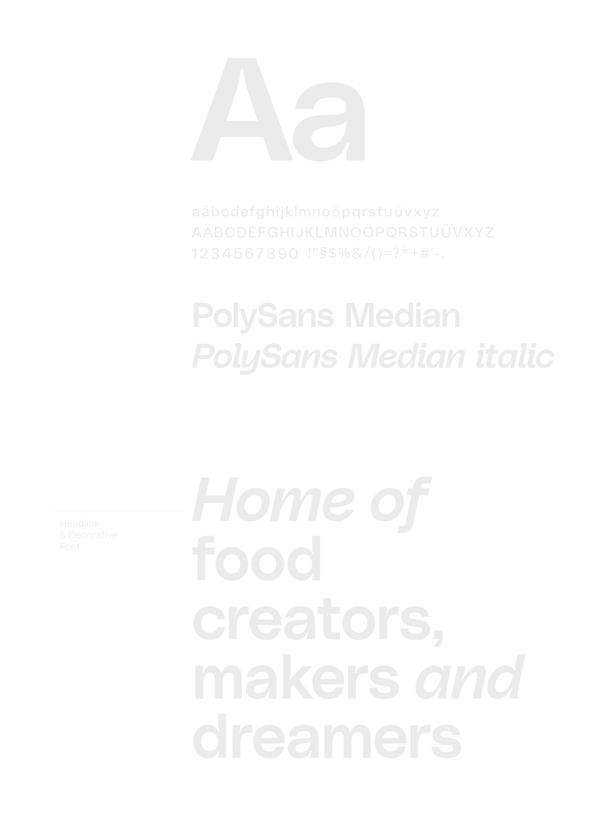
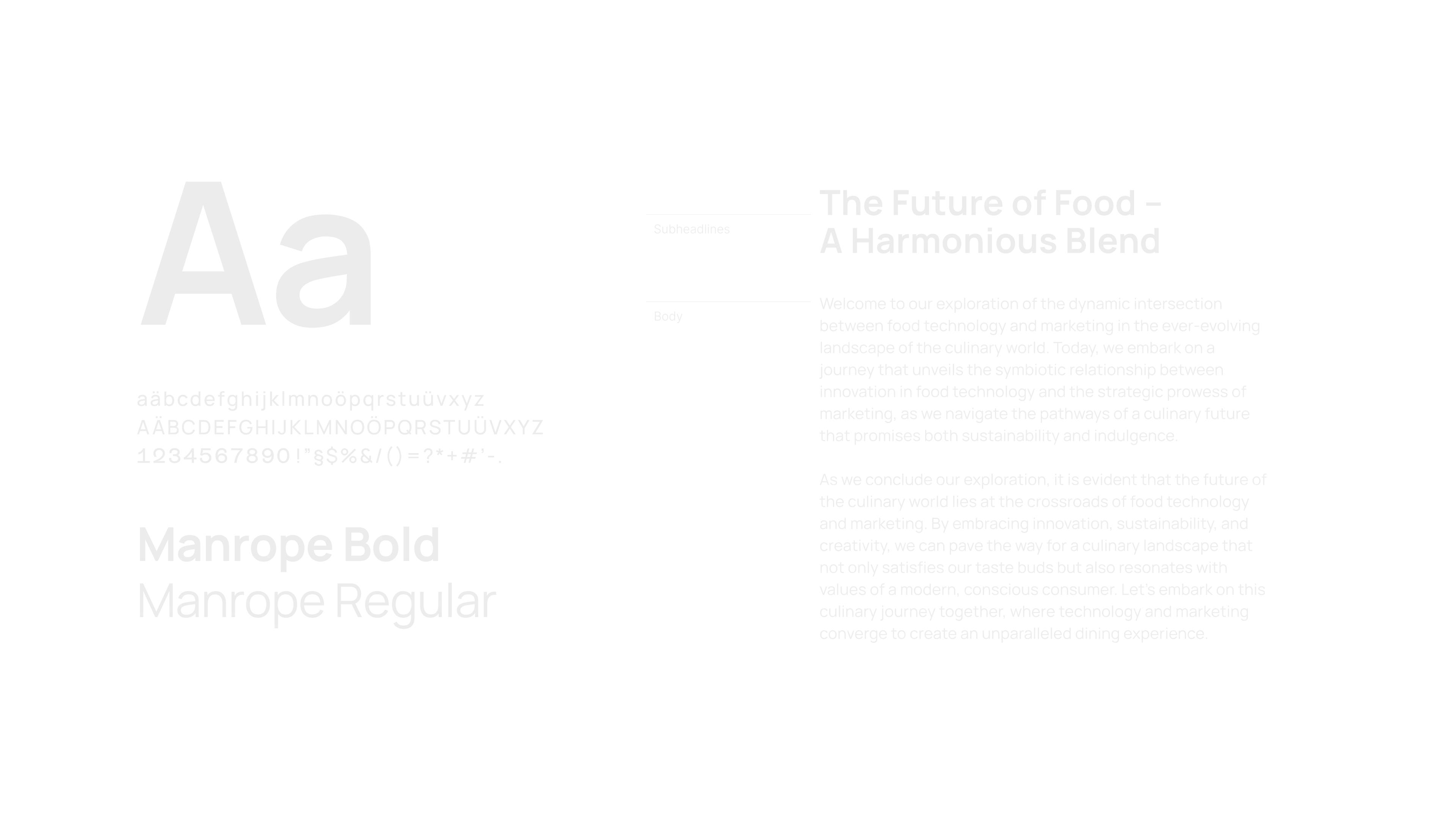
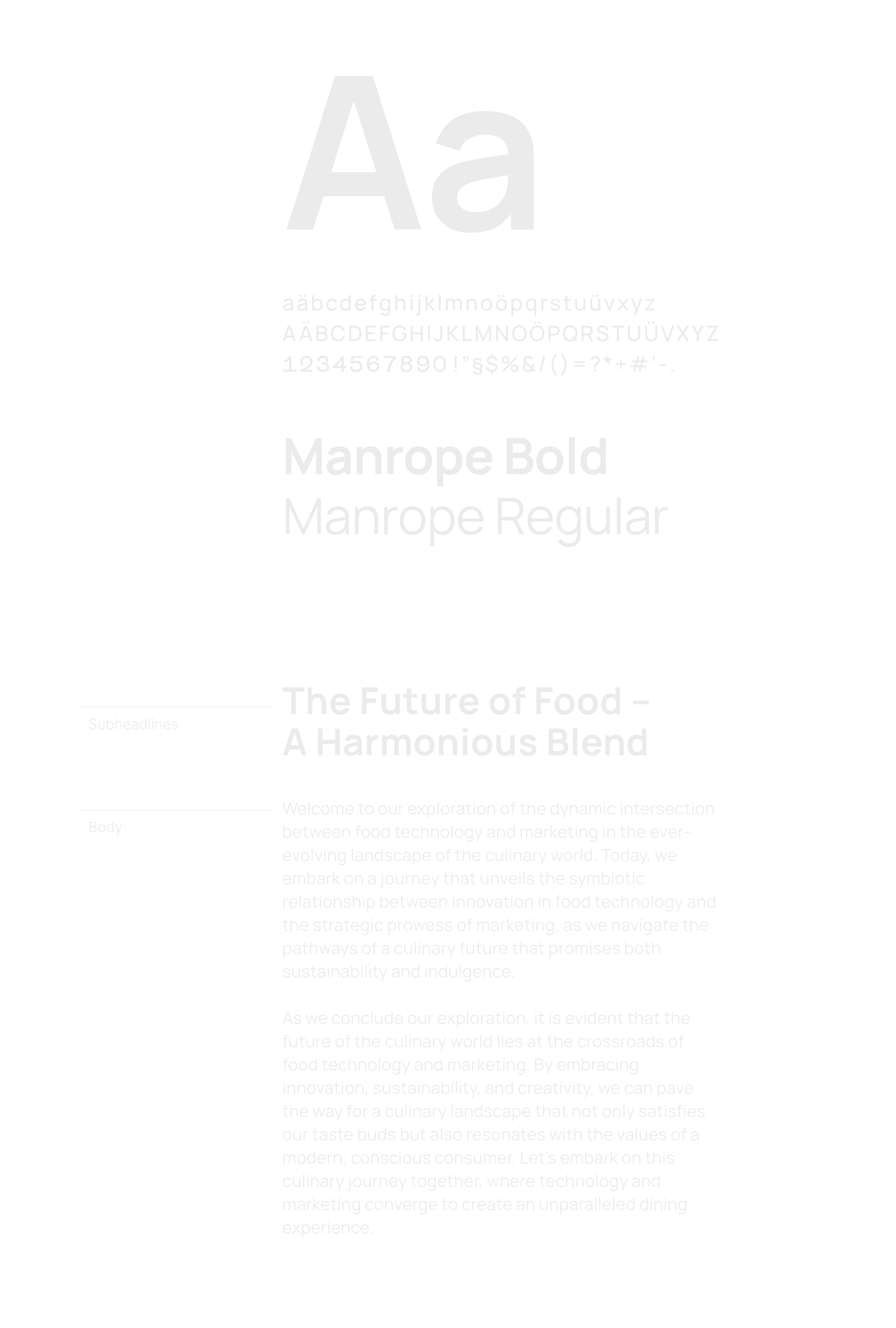
Design System
Creation