Case
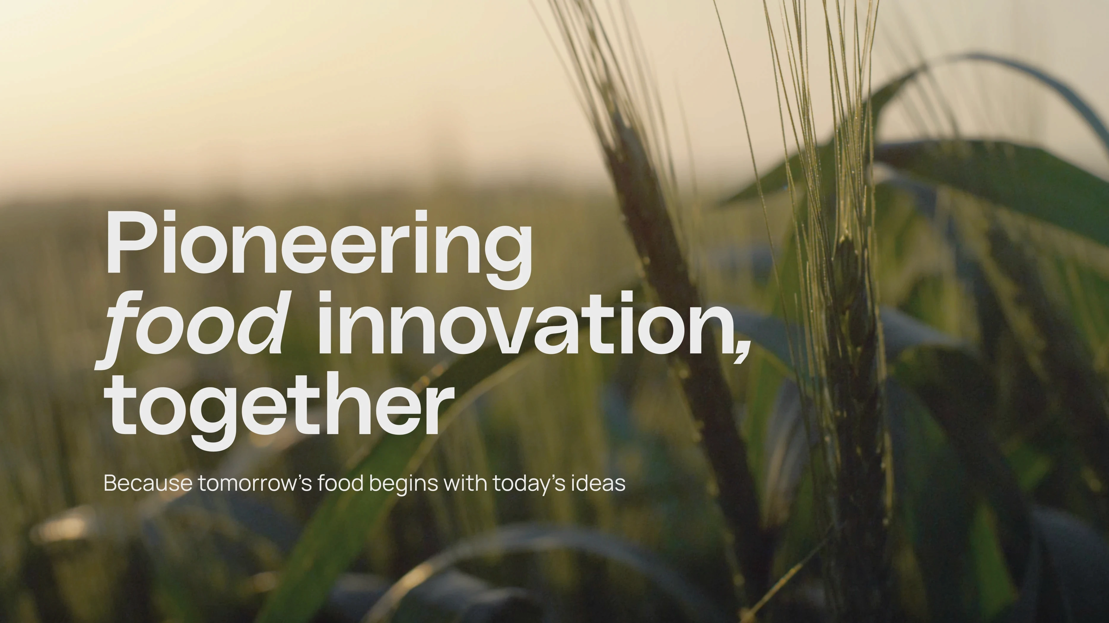
The task was to develop a cohesive and engaging brand identity for a regional food hub of the cities Bremen and Bremerhaven that serves as a platform for collaboration, trade, innovation, and research within the local food economy. The hub connects stakeholders across the entire value chain – from producers to processors and distributors – with the goal of fostering sustainable products and innovative marketing and distribution strategies.
Idea
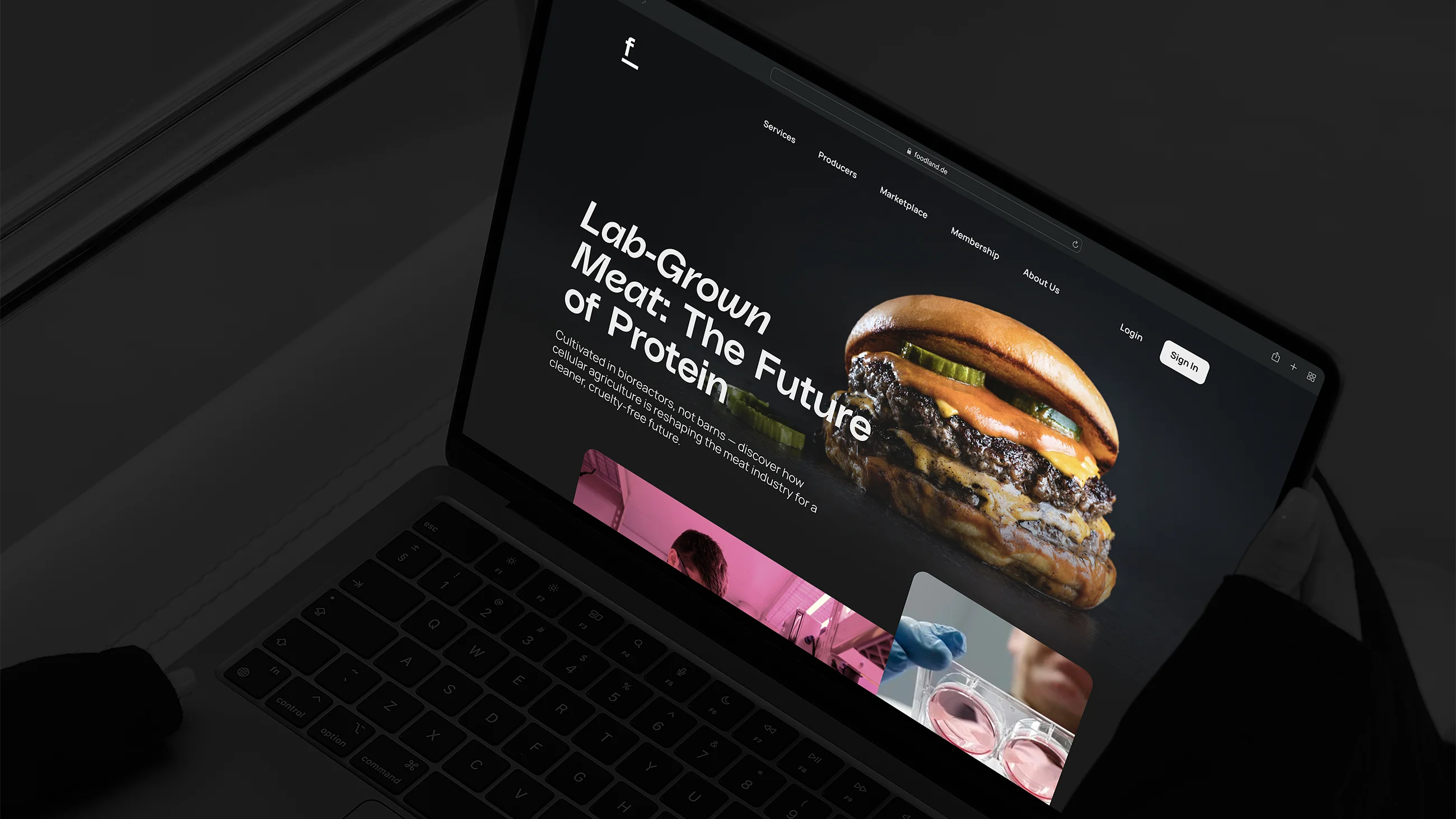
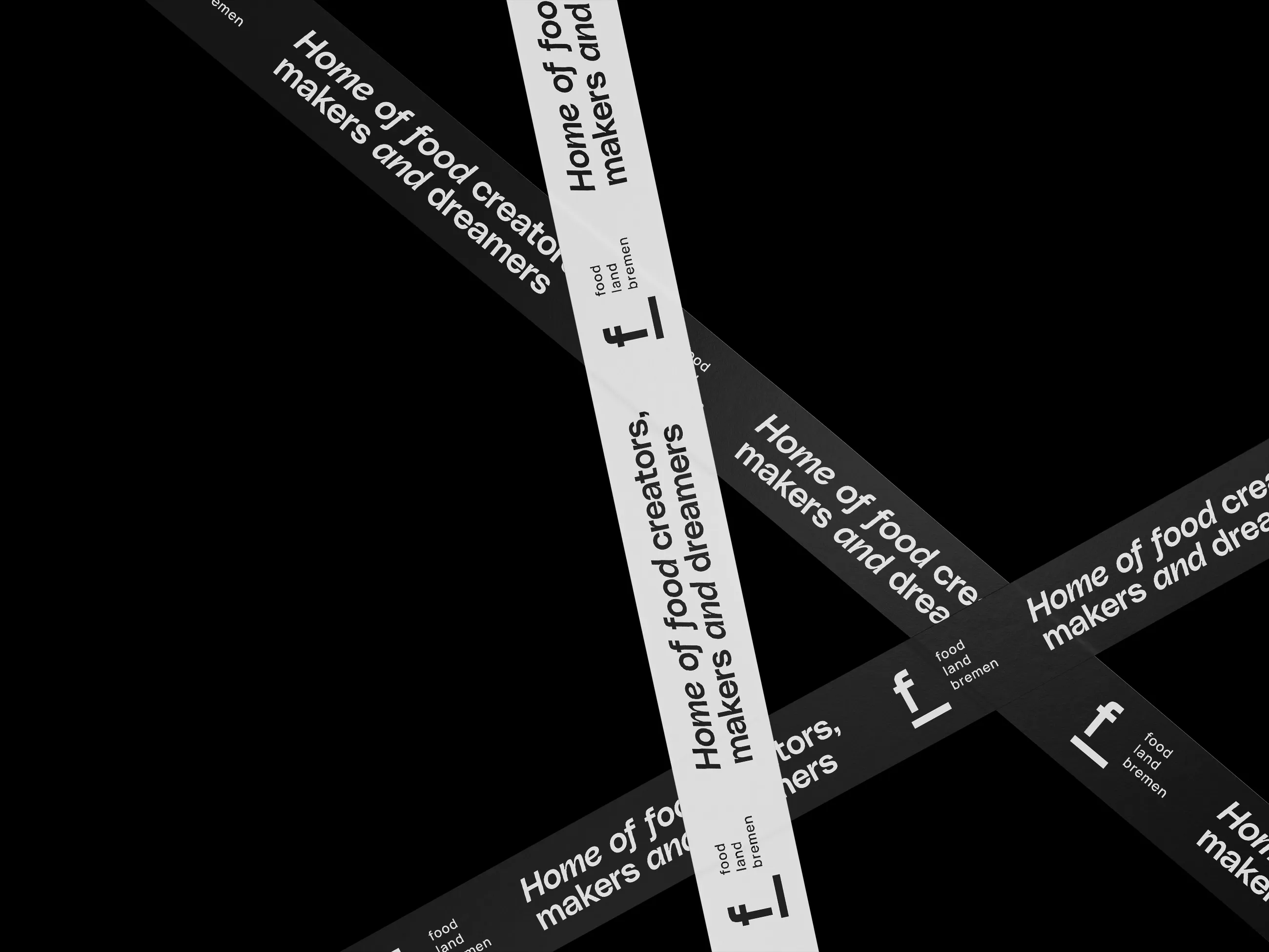
The logo is composed of the initial letters of the name. The second letter is rotated 90 degrees and forms the foundation for the first – a design element that conveys stability and orientation. At the same time, the overall form symbolizes a view beyond the horizon, representing foresight and a forward-looking mindset.
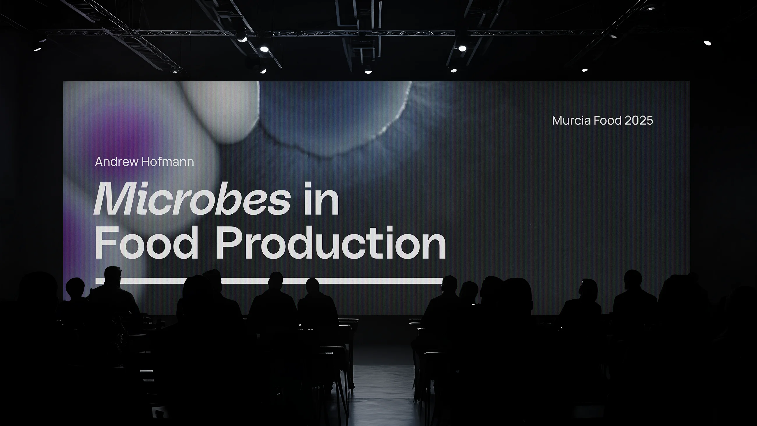
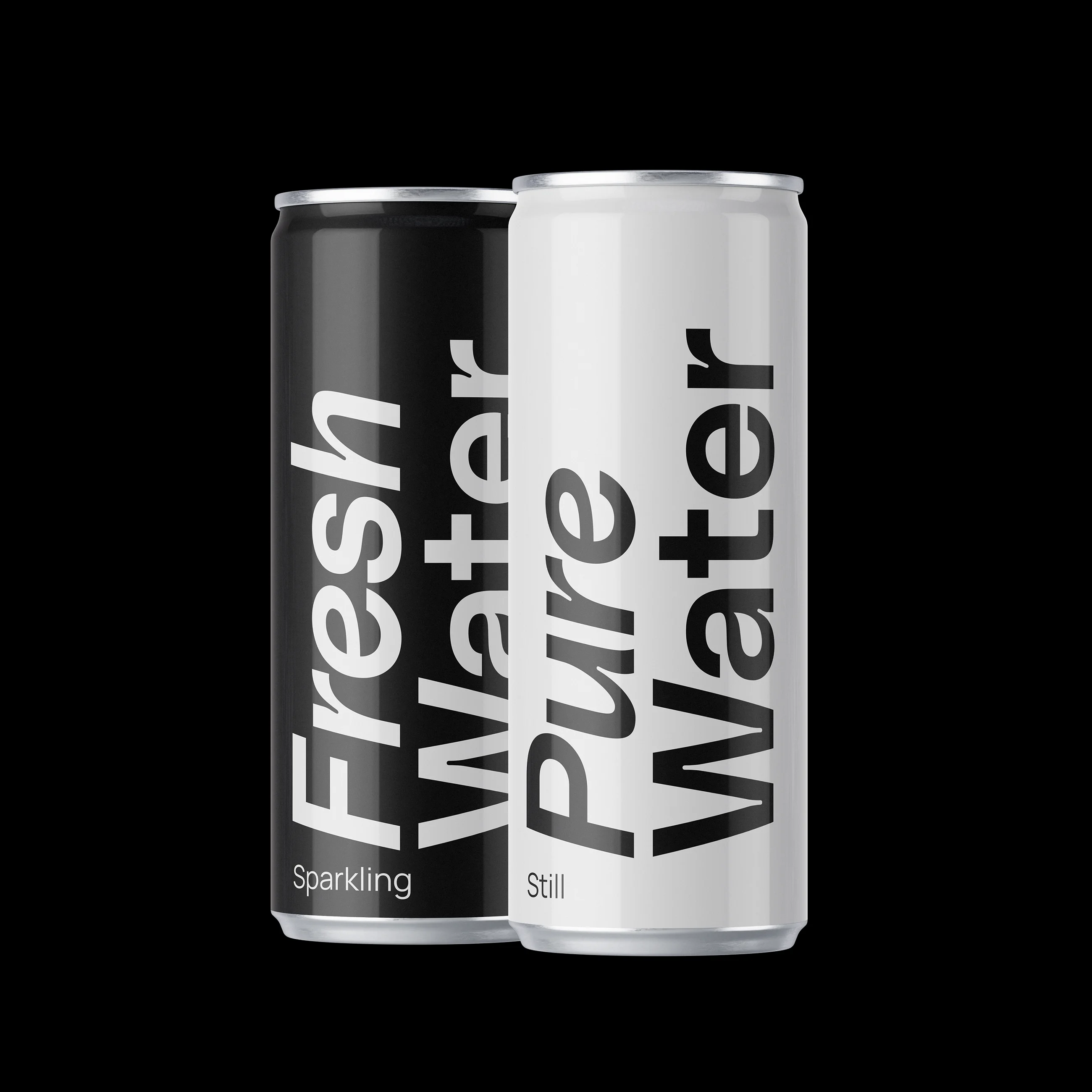
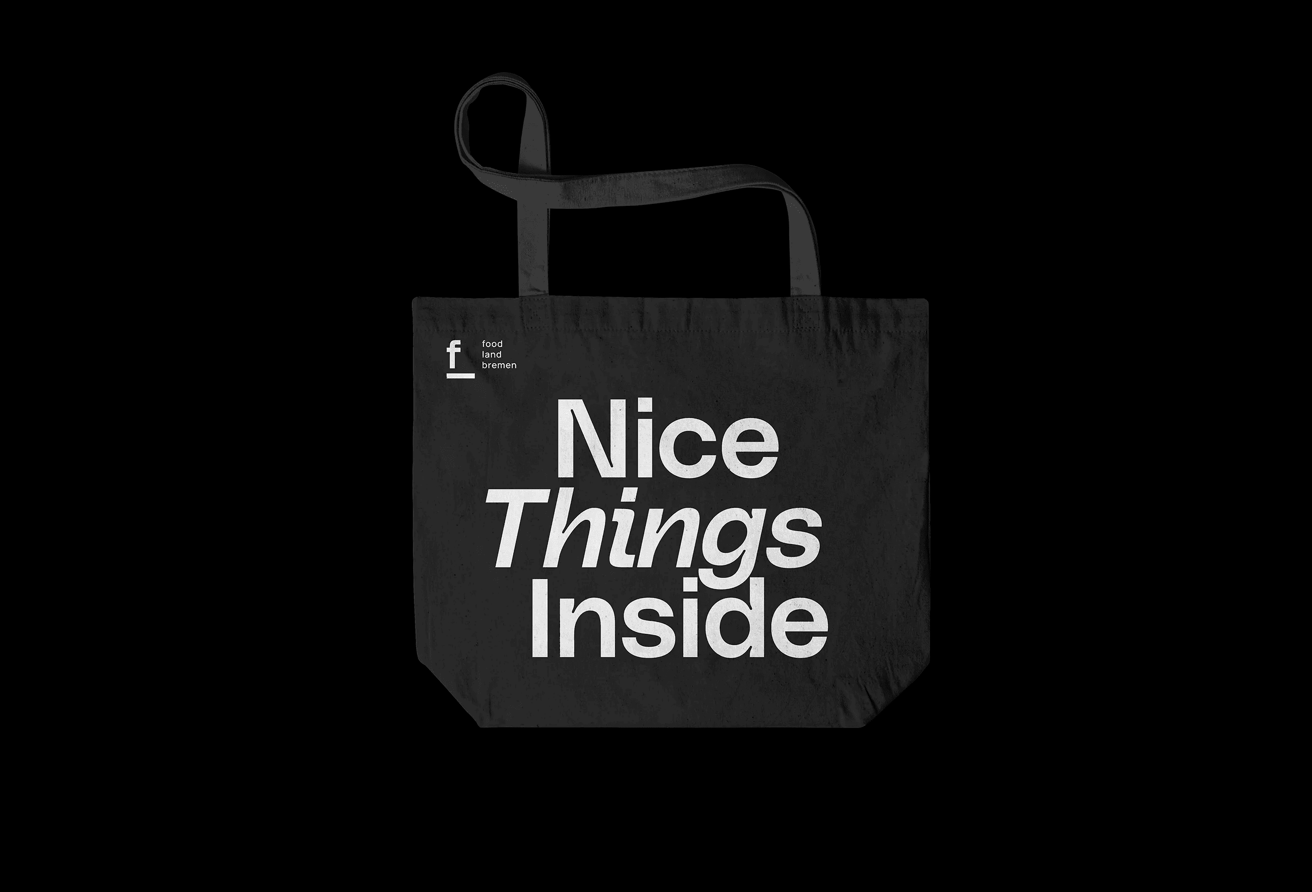
The horizon line, combined with a clear and modern typeface, forms the core of the brand identity. The design is complemented by neutral light-dark contrasts and the use of subtly muted natural tones and understated imagery.